Headshots – FAQ’s
08.01.2026
Lorentz Gullachsen
Linkedin Headshot or Brand image?
Increasingly the importance of Linkedin for business is becoming more apparent, I am aware that it is the platform where professionals can be found, and certainly there seems to be many coaches and trainers helping people have a great Linkedin presence who seem to be omni present?.
Most business that are B2B realise that most clients are just a few clicks away on Linkedin, however the platform is not to be used as a mailing list, but a place to build connections, establish trust and long term develop business relationships.
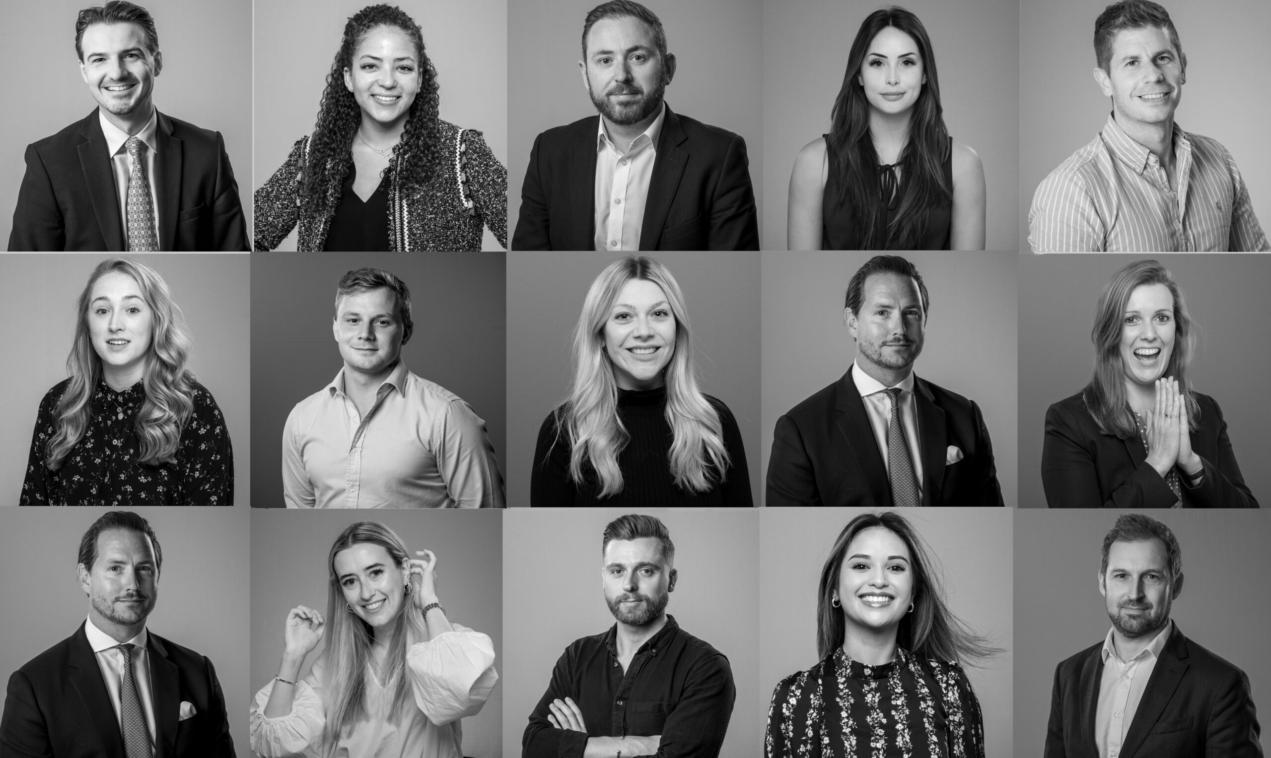
I have attended a few talks and even gone to Linkedin conferences, although as a commission, so I do think I have certain qualifications to help clients with their Linkedin presence, especially when it comes to their headshot. This simple image is possibly the most important visual asset yu have, it is the image that provides the first impression.
So get it right.
A few millimetres of real estate is all you have, so try to use an image that communicates what you want to say.
Obvious, yes but vanity and emotions get in the way of good visual communication.
A wonderful holiday may produce a picture that shows you with a great tan and makes you smile every time you look at it, but is it the best image for your profile?
It does not have to be a ‘standard’ headshot, I never ever believe that there is an ideal way of producing the best headshot for anyone, you are an individual, the only one of you ever, you are unique.
There are not rules, not that I am aware of, no tried and certain best practice, a headshot is possibly expected but does it have to be the same as someone else?
It depends on many factors, one is what do you want to do on linkedin? Attract a new employer, build your business in a niche sector, provide a professional service or a freelance creative looking for a new client or agency to work with?
Whatever is the case, there are a few considerations.
1 The image is going to represent you on your profile, but also every time you comment or communicate on the platform.
2 It is a small image on most smartphones it is a few millimetres at most. So ensure it is clear, not a blur!
3 Simple is best? If you do want to be recognised, consider a simple up to date image.
4 Black & White or Colour? There is a recent trend to return to ‘serious’ monochrome images, certainly in many ‘professions’ such as accountants, Solisitors but what does the monochrome image say about you? Are you stuck in a bygone age? Or super hip?
I am personally a great fan of monochrome images, taking colour out makes the image stand out with its simplicity, but be careful, trends change and you maybe seen as trying too hard or concealing something?
5 Build your Brand ? With your colour palette of the stand out clothes that you wear, you want to reenforce the visual brand you have when you are in the networking ecosystem.
Each simple headshot can be so much more complex, when you consider all the factors involved.
So when you get around to changing the headshot on Linkedin – have the conversation with your photographer or are you going to use an Ai avatar ?
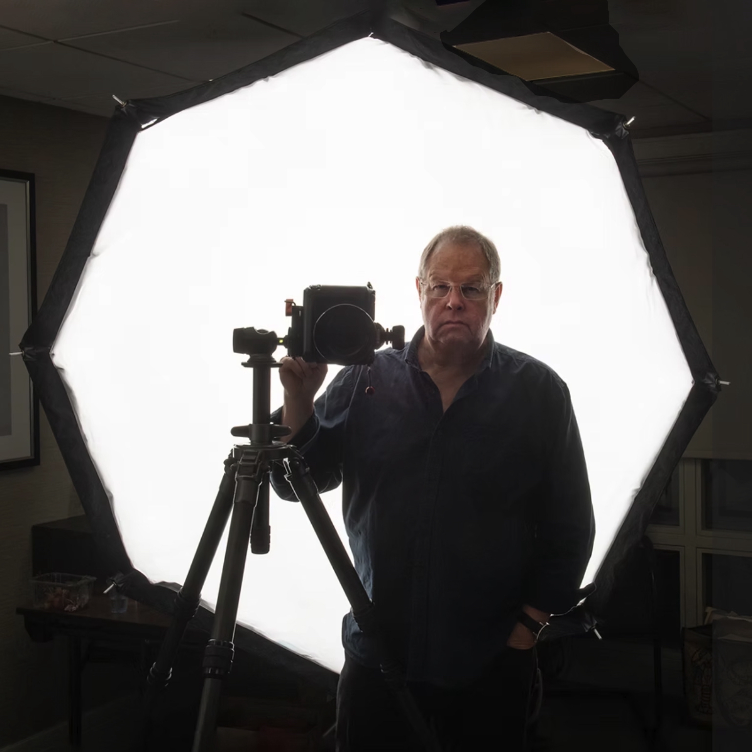
My recent update of a ‘headshot’ is not a headshot, I just tried to communicate what I do, in a simple way that works even at 4mm across?
I have created an image that works at a basic level, it has the elements that are related to my profession, a camera, a light and a serious tripod also adds to the mix, all those elements signify I am a photographer, but also I am a professional as the kit indicates much more that just an enthusiast, it all could be owned and used by anyone who enjoys photography and has the money to hire or buy the kit, however the image is a ‘shorthand’ communication to state my status as a serious player?
The image came about when I was setting up for a portrait session at the Stratford Literary Festival, I was trying to replicate what my subjects would see, how difficult it is for those in front of a camera, I had many attempts as there are often long periods between the subjects, I often photograph myself not for use as a selfie, but as a lighting test as I want the subject too be fully engaged from the first image I take, often I only have a few minutes or even seconds, so I need to have the lighting and exposure spot on. So my face has stood in for many hundreds if not thousands of faces, fortunately not seen that often. That is another reason that my Brand portrait is as it is, I am in silhouette, my craggy features are not front and centre, I am present, but not the main subject?
I am now using this across many platforms and sites, as it has become a Brand image, something like a logo, although I have one of those, but a logo does not convey my work, if there was a reference to photography that would be different, so my brand has taken on a new image that almost by default has become my Brand.
You to can develop a ‘brand’ image, but it may take a little trial and error, see how people respond, get feedback, try variations , you may have to include props and symbols but it is worth the effort in these days of digital fog?
You're at the end of the list, view more of my blog posts here
View my blog